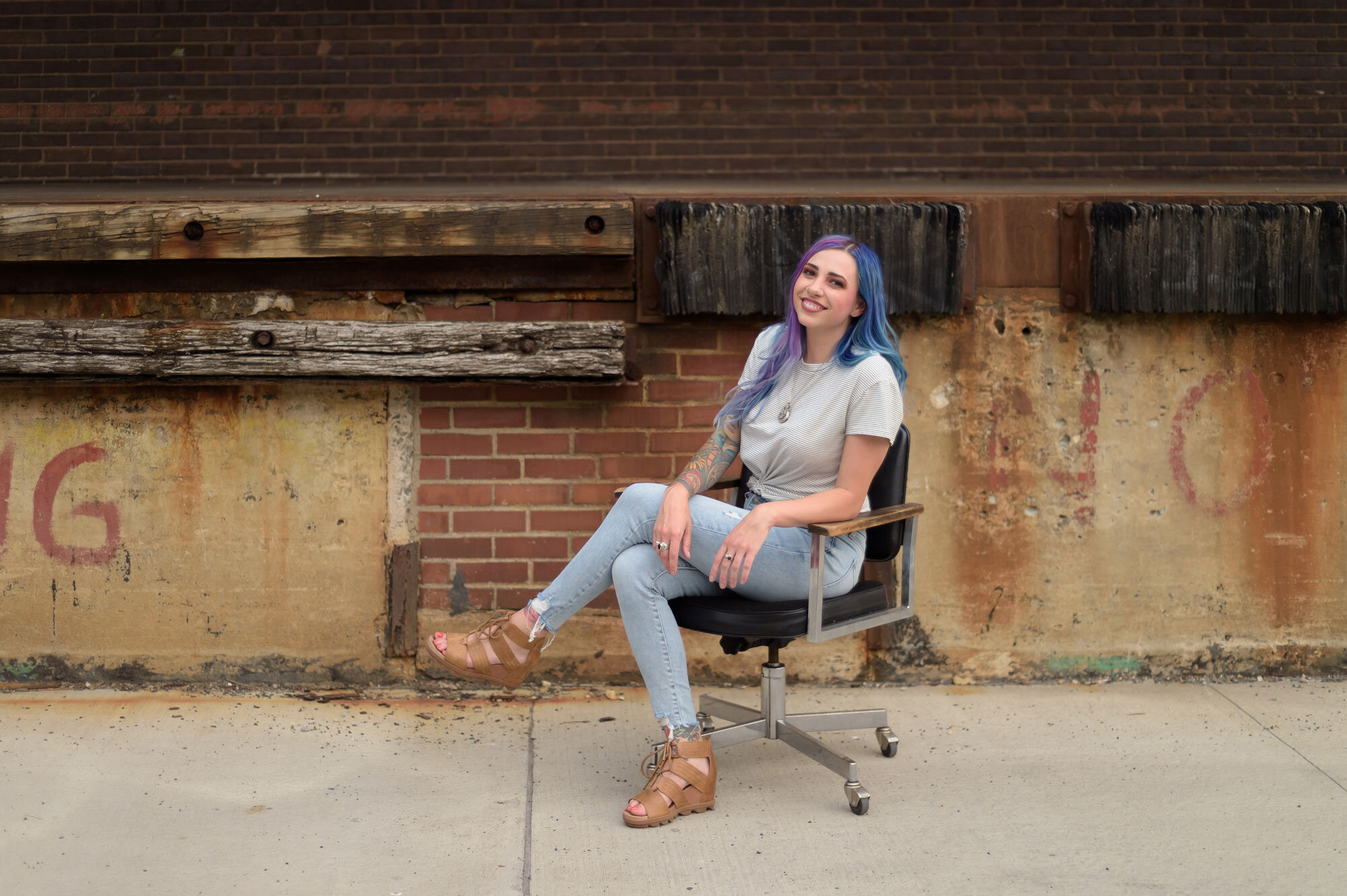
3 Reasons I'm Over the 'Light & Airy' Branding Photo Aesthetic
I’m Going Out on a Limb Here…
I’m over the whole ‘light, bright, & airy’ branding photography aesthetic. This style has been taking over Instagram for some time now and I’m ready for a change.
Think about it, how much can you really stand out as a brand when your photo aesthetic looks like everyone else (including your competition)?
How to Stand Out From Your Competition:
⠀⠀
✨ Focus on Your Own Brand & Aesthetic.
✨ Put Blinders On!
✨ Don't Be Afraid to Try Something Different!
Sure, the light & airy look is popular -- but does it make sense for your brand?
If you want to stand out from everyone else on social media, keep on reading and learn the brand aesthetic I'm excited to photograph more of in 2022!
1. It’s Been Done — a lot.
It doesn't take a veteran Instagram user to see that the light & airy look has been very popular -- for a long time.
Following suit behind other brands won't necessarily help you stand out. Including moodier and more shadow-y images in your branding instantly sets you apart because it’s simply not done very often!
2. Branding Photography isn’t ‘One-Size-Fits-All’
Just like your business plan, branding photography should be custom. Brand images should reflect no one else but your brand!
This same concept goes for stock photography too. Ya know those free stock images on Canva you use for social posts? Those are the same free stock images every other brand is using too.
Custom images help set your content apart and blend perfectly with your overall aesthetic. Plus, they help tell your story without having to say (or type) a word!
3. It’s Not Real or Relatable
Is your workspace as perfectly lit as the light & airy style portrays? If you're a human, probably not. No one's office boasts multi-point lighting at all times.
Only including picture-perfect images in your branding may paint an inaccurate picture of your business.
Uncommon Collaborative’s biggest focus is creating authentic imagery that helps customers connect with brands. If you’re trying to connect with your customers, you may want to consider including those less than perfect captures too.
TO BE FAIR, THERE’S A TIME AND PLACE FOR LIGHT & AIRY BRAND PHOTOS BUT,
Shadows are interesting!
There's a time and place for light & airy photos, but the same goes for moody images too.
Not every social post shares the same mood or subject. Balancing light & airy photos with more real imagery balances your brand's visual presence!
Inspired?
Reach out to start planning your brand photography session!


